I don't know which is the bigger shit take, but this galaxy brained youtuber devotes over 3 minutes of a retro gaming video to slam housing projects as terrible. She laments that some of these terrible buildings are still in use, with footage of her touring what look like well mentioned social housing units to me. Then she cuts to still images of egregious dilapidated examples that obviously weren't part of the tour.
"Thankfully across the UK though, most brutalist buildings have been demolished."
Someone might want to tell her about Grenfell?
"Are there no prisons? Are there no workhouses?"
:ukkk: :ukkk: :ukkk: :ukkk: :ukkk: :ukkk: :ukkk: :ukkk: :ukkk: :ukkk: :ukkk: :ukkk: :ukkk: :ukkk: :ukkk: :ukkk: :ukkk: :ukkk: :ukkk: :ukkk: :ukkk: :ukkk: :ukkk:
Fun fact: Soviet apartment blocks everyone keeps calling brutalist are actually functionalist. The union wasn't particularly big on brutalist housing .
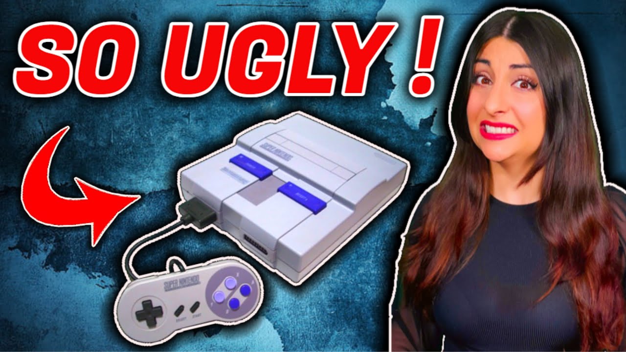
Is that what the US Snes looks like? It's rad. This style was in fashion in the 90s. It looks good.
The original design was probably considered too childish looking for US audiences. Trying to be mature and cool could make or break your product back then
Yep, they were competing against the jet black angles of the Sega Genesis and their attitude-ladened spokes-hog, Sonic
It's a goddamn wonder the NES was able to take off like it did in the Post-Atari hellscape that was 1985 and Nintendo wasn't in the mood to fuck things up in 1991
The snes was ugly compared to the super famicom and the plastic turned yellow over time.
No game console was brave enough enough to have colorful buttons in the USA until the Xbox.
The grey snes also led to the grey ps1. I’m not sure why that shade of grey was chosen, but it was fairly common for the era. Black plastic was expensive and cooler. White was rare. But textured grey was everywhere.
No game console was brave enough enough to have colorful buttons in the USA until the Xbox.
There was also the gamecube controller that same week, damn thing looked like a fisher price toy
The fact 2 buttons were grey and the cheaper look of the plastic at the time.
But somehow the colors didn’t stand out as much as the shapes.
Fuck. I also forgot the n64 had different color buttons.
Still vastly prefer how Xbox has it with the main face buttons each having their own color + letter.
The weak spot are the bumpers. Icons/ notes in the game need the big L or something to cause a trigger squeeze.
Fuck. I also forgot the n64 had different color buttons.
Same lol
i really liked the suepr famicom's visuals, complete with colorful buttons on the controller, but who really gives a fuck? it's not like i'm looking at the console aside from the 2 seconds it takes me to plug in the game.