It's just my opinion (since it's not in the article) but a thing that makes Gnome and Libadwaita a "modern design" is the fact that the production behind it tries to bridge the gap between a "mouse and keyboard" and a "touch screen" workflow.
None of the other DEs come even close to Gnome when used on a tablet
meh, subjectively i find that creates a "worst of both worlds" situation. but this comment was more about the futility of the development time that went into this specific feature
this comment was more about the futility of the development time that went into this specific feature
yeah sorry, I should have been more specific with my answer: features like this are supposed to help you in a touch screen situation or in general with smaller screens.
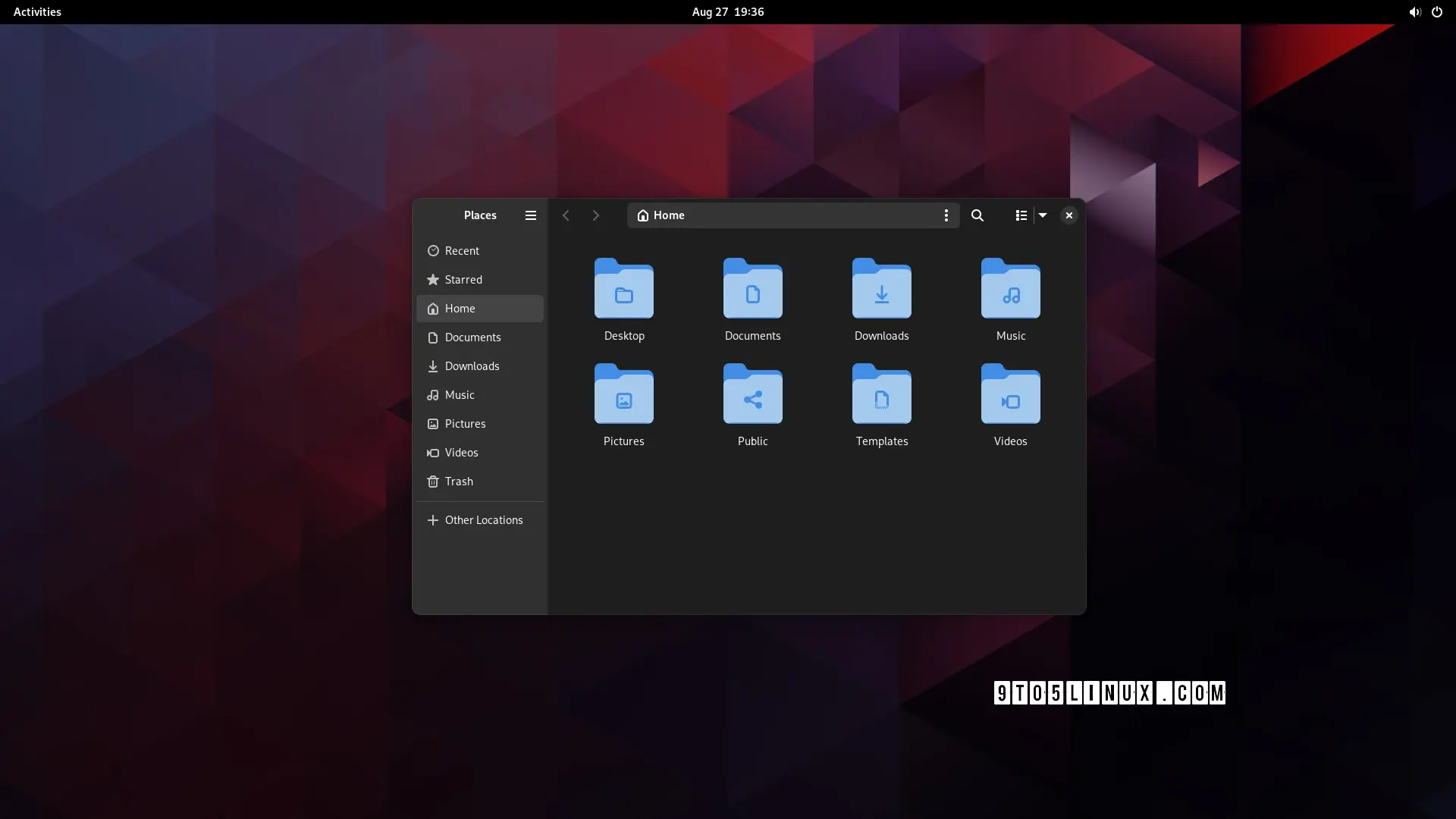
When the window is resized under a certain size, the left panel becomes hidden and with it part of the top bar, to make it less cluttered and confusing.
The difference is minimal, in the newer version you have 1 less element when the sidebar is collapsed (the hamburger menu).
Generally speaking Gnome 44 is already well optimized, 45 is going to be a more "tweaks and small improvements" kind of update rather than a big design changes

It's just my opinion (since it's not in the article) but a thing that makes Gnome and Libadwaita a "modern design" is the fact that the production behind it tries to bridge the gap between a "mouse and keyboard" and a "touch screen" workflow.
None of the other DEs come even close to Gnome when used on a tablet
meh, subjectively i find that creates a "worst of both worlds" situation. but this comment was more about the futility of the development time that went into this specific feature
yeah sorry, I should have been more specific with my answer: features like this are supposed to help you in a touch screen situation or in general with smaller screens.
When the window is resized under a certain size, the left panel becomes hidden and with it part of the top bar, to make it less cluttered and confusing.
but ...surely you could just do the same thing with the old design? artist's rendition:
*removed externally hosted image*
in fact, now i look at it, it makes them look even more similar once i collapse the sidebar
The difference is minimal, in the newer version you have 1 less element when the sidebar is collapsed (the hamburger menu).
Generally speaking Gnome 44 is already well optimized, 45 is going to be a more "tweaks and small improvements" kind of update rather than a big design changes
Agreed, I'm not an expert, kind of new to linux, but I could see being very comfortable on a Gnome based tablet.