
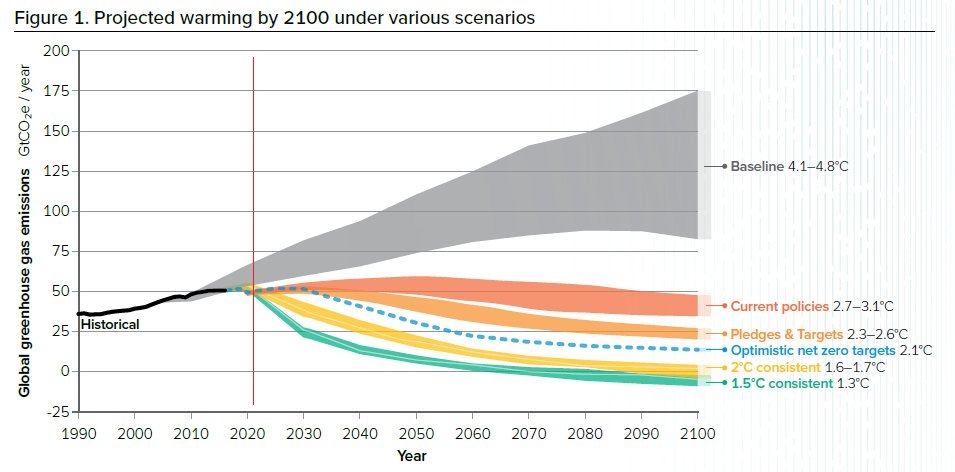
Figures and previews from the forthcoming IPCC AR6 (due out in July) are starting to come out. They're not looking great. Limiting warming to 2 degrees C or less is now virtually impossible, as even the most optimistic net carbon zero projections put us at 2.1 degrees of warming by 2100. More realistic target is now in the 2.5-3.5 degrees of warming range, which is likely to be extremely bad for a lot of people.
The authors of the IPCC report suggest that only an "immediate and radical transformation" of the global economy and governance would allow us to avoid the worst of the oncoming climate catastrophe. This kind of language is a marked difference from earlier IPCC reports, and reflects a growing sense of urgency and impending doom within the climatology community broadly.
What's the source of this? I'd love to use it.
Hey thanks for asking, here is the source plotted by Dr. Robert Rohde, Lead Scientist for Berkeley Earth https://twitter.com/RARohde/status/1061932205327429632?s=20
And thank you for sharing!