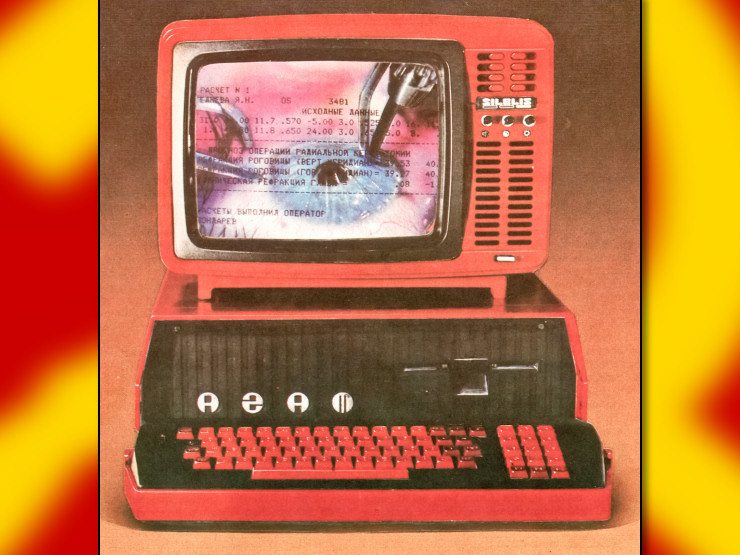
Productivity software, computer maintenance tools, creative software suites, integrated development environments, habit trackers, language learning apps, video games, video streaming libraries, pretty much anything that involves a screen feels bad. It's so odd that every bit of software's UI/UX feels both overly designed/bloated but also simultaneously barren and empty. Software design seems increasingly unable to fulfill its basic functionality. So many of the bits of software that we interact with feel identical but also somehow feel distinctly bad.
I can't articulate how capitalism is to blame but if any of you could help I would appreciate it.
You’d think that there would be some sort of universal visual/technical language we can all agree upon but it seems that there is no real driving aesthetic philosophy for systems we use every day. Aside from getting users to interact with a payment system/outlet all of the software we use has dreadful UI/UX.
Paying for something is very easy. Simple and intuitive (most of the time), it’s usually one to four clicks/taps but actually using a thing is seemingly more difficult. Using a common feature of a product can be somewhere between two to nine clicks/taps. I don’t think everything should be command-line interfaces (CLI) of course, but I will say that CLI at least usually allow users to get what they want.
I know it’s usually answered with “because money”, but how and why are UI/UX so universally bad for pretty much every bit of software we all use? It feels kind like how every car (fuck cars) had the same weird amorphous shape that is both considered “normal” must also universally unappealing.
What happened?


the iphone happened
I didn't quite realize how profoundly terrible the iPhone mobile design has had on everything designwise.
deleted by creator
iOS has actually good UI design most of the time. Desktop software is where UI design sucks, because there aren't any good UI frameworks for most programming languages.
Are GTK4 and QT6 not good enough?
The worst desktop UIs I see are all electron apps.
I'm 100% convinced there must be a better way to program GUIs than what these libraries with their massive class hierarchies do. I just don't know what it is. That stuff's painful to use. It's not so bad when you're just sticking to the premade widgets, but fuck you if you need to create your own widget, the whole glorious spaghetti mess of multiple levels of superclasses becomes visible. The other annoying thing is that I'm fairly convinced that correct way to structure the data→display pipeline is to write it like a stateless function. But you can't do that because GUI frameworks are like an eldritch horror of persistent state. Well I never figured it out, anyway. OO was a mistake.
Agreed 100%. UI stuff is always so clunky. Dozens of implementation attempts, none good.
I'm not actually familiar with them, but don't Elm & Relm4 fit that paradigm a lot better?
No side effects gang 😎
Can you use either of those from any language other than C++? And it really isn't convenient in any way to actually use existing GUI frameworks and publish desktop applications. The web stuff is so popular because it's easy to actually publish it in a polished form (as a website) or some packaged Windows program (Electron).
Yes there are bindings for tons of languages. The frameworks themselves are either C or C++, but applications targeting them can be any language with bindings.
Idk anything about Windows packaging, but Linux apps are easy enough to publish.
I know easy, consolidated web, mobile, & desktop UI is what makes electron so popular, but it's so sluggish with UI that doesn't fit in any native system.
GTK apps are so clean by comparison. Still largely unused, but the GTK broadway backend could be used to render apps in a browser.