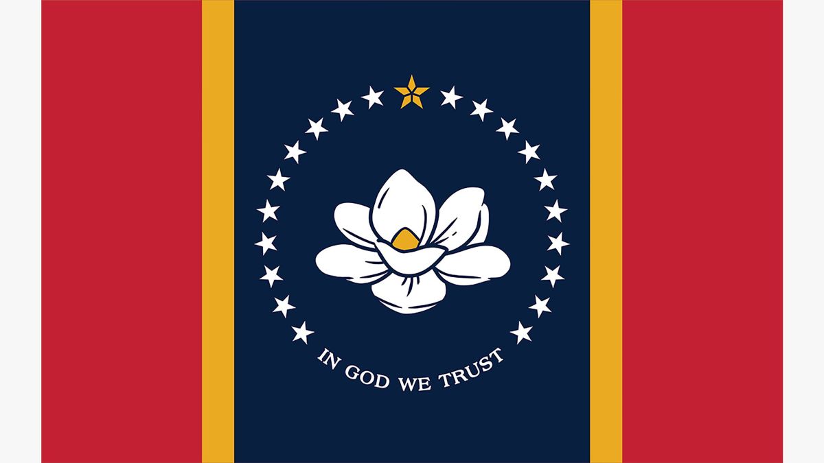
I wish more states would have referendums to change flags, so many state flags in the US look fucking awful
There are actually several good ones, even if they're the minority. Colorado, Arizona, Alaska, New Mexico, Indiana and arguably Maryland are all good. There are several passable ones, like Ohio, Texas, Tennessee, or South Carolina. Georgia's is good aesthetically, though not ideologically. Wyoming's would be good if they removed the seal.
more states should have referendums in general but we live in hellworld where several states only the legislature can refer something for public voting.
God is fucked. God remains fucked. And we have fucked him. How shall we comfort ourselves, the copulators of all copulators? What was holiest and mightiest of all that the world has yet owned has cum buckets under our touch: who will wipe this goo off us? What water is there for us to clean ourselves? What festivals of atonement, what sacred games shall we have to invent? Is not the greatness of this sexual conquest too great for us? Must we ourselves not become gods simply to appear worthy of it?
I actually like this flag. It's simple but would be way better if they dropped the christianity bullshit from it.
Ugh, of course it has "In God We Trust"
Better than having the Confederate flag but still
Literally one of the only requirements for the competition was that it had to include the phrase. Dumb as heck but whatever, still an improvement
This flag is frustrating to me because it's so close to being a really slick, nice looking flag. But it's just a tiny bit too busy. If I were the omnipotent god of mississippi's flag (with no other powers) I'd tell them they can pick one of the gold star, white stars, slogan, and flower, and all the rest gotta go. Personally I think I'd go with the flower, but that's partly because I have no idea what the stars represent. Maybe the gold star alone would be cool, depending on what its supposed to stand for.
It's better than their old flag, that's all I'm going to say. Chuds in my state are selling the old Mississippi flag, along with Trump flags, Blue Lives Matter flags and of course, the confederate flag. We had a weird Trump truck rally last week of these dipshits flying all those flags lined up together.
My favorite before the invention of the Blue Lives Matter flag, was when these morons would line up the confederate flag next to the US flag, like they can't see the contradiction of that. They have since replaced the US flag with the thin blue line one, and are just publicly screaming that they are bootlicking fascists.
Have you seen the Confederate and American flag combo? One half American flag one half Confederate. I've seen that flown in conjunction with a half US half Israel flag as well.
The in god we trust is dogshit not just because of it saying in god we trust but because any text on a flag is dogshit
Im so tired of people saying text on flags is bad. Brazils flag is one of the best flags around and it has text on it.
exactly like your rule, this sentence you just spat out also means absolutely nothing. git gud
The tints of the different colors could be a bit better I feel, but overall I like it.
Do the number of stars represent anything?
Also what was the Mississippi flag before 2001?
wtf happened in 1906 to make them decide to disconnect the confederate flag from the rest of the flag
the fact that it originally connected and was specifically changed to look like a compilation of clip art is utterly baffling
The reason may be that some versions of the battle flag had a white border
Four decades after the war, the United Confederate Veterans imposed a uniformity that did not exist during the war, officially designating the blue cross on a square-shaped red field with a white border as the Confederate Battle Flag.
https://www.essentialcivilwarcurriculum.com/the-confederate-flag.html
Four decades would line up with 1906
some versions of the battle flag had a white border
Ohhhh, that makes sense. It's a border around the recognizable confederate flag bit, not an extension of the white stripe. It's still hideous, but at least that makes sense.
New question, what the fuck were they thinking? Just look at figure 3 in your link. It's like a website that doesn't know how to format your picture correctly lmao
Lol, yeah, that one looks pretty bad. As I understand it, the white flag with emblem in top left is a naval ensign or something. Could be confused with a white flag of retreat if the wind wasn't blowing, so they put the red bar on the right edge
See some examples here https://en.wikipedia.org/wiki/Naval_ensign
One of the better looking state flags now, I admit. Alaska's is still the best IMO, followed by Indiana and California . But most state flags look like utter dogshit. Just take a look at Iowa .
South Carolina's has a beautiful design, but it's poorly executed when seeing it up close. A minor revision could elevate it to the top tier. I do agree on NM- timeless and iconic.
Oregon's is the only double-sided flag but other than that it's pretty shit
Woulda looked better with the gold five-petal star alone in the center (in place of the flower), with no text and no semicircle of stars imo, but still a notable improvement over both the 2001 designs.
i like it! but i wonder if the design couldve worked better if the gold star was also the flower.
given that this one reads like a big dog whistle of other less well known confederate flags to me, im gonna go with "it doesnt fucking matter"
circle of stars on a blue field, the two red bars, the white borders, even the gold bars could be pulled from van doorn or some shit... am i the only one seeing that? feels like im taking crazy pills here
theres quite a few confederate flags that involved indigenous tribes. cause, plot twist, there were tribes that fought on behalf of the confederacy


